Traffic & Offers Club
branding, community
Traffic & Offers Club is a community of entrepreneurs striving to reach their business goals through a straightforward, no-frills approach. The emerging community needed a look & feel that would embody the founder’s business philosophy of simplicity, professionalism, and a focus on consistent action.
The visual identity needed to both set T&OC apart from a myriad of cheap “online business” groups and be practical and delightful in use for all of the many community applications

Process
I started looking for a way to represent how consistent action leads to progress and growth. But it also should have been a basis for a flexible visual language — clarifying community navigation, engaging audience with the core values, and looking sleek on marketing materials.
The repeating yet dynamic patterns became a foundation for this visual language. They repeat, they evolve. You put in the reps, your business grows. Versatile and consistent, they allowed me to create a system that works in any format or context. Different types of patterns and flips of the color scheme let you visually organize the community spaces and content and streamline the navigation for members.
Working with a loooong name I developed a simple logo system: including a vertical lockup for the full wordmark, a shortened ‘T&OC’ monogram, and a standalone ampersand icon. This ‘&’ became one of the central elements as a versatile icon representing the connection between members.
The color palette, featuring contrasting white, teal, and charcoal, strikes a professional and minimalist tone, aligning with the community's focus on business and minimalism.

monogram logo version
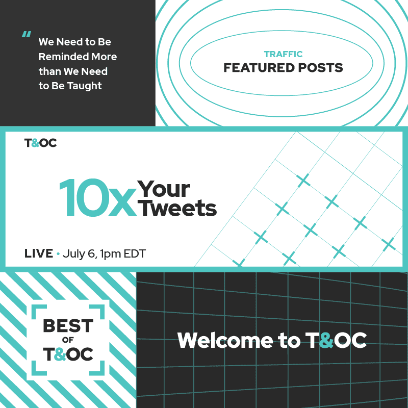
various community designs

ampersand icon in a geometric pattern
Outcome
The T&OC identity has captured the essence of the community's philosophy, offering a distinctive yet accessible brand that resonates with entrepreneurs seeking a straightforward path to success. Through its dynamic patterns, bold color choices, and versatile logo system, the visual identity effectively guides members through their business journey, fostering a sense of connection and forward momentum.
