Beaver Duck
logo design, visual identity
Beaver Duck is an ecommerce store that specializes in quirky and fun t-shirt designs. The new store was looking for a logo that would communicate the charm and creativity of its prints.
logo design, visual identity
Beaver Duck is an ecommerce store that specializes in quirky and fun t-shirt designs. The new store was looking for a logo that would communicate the charm and creativity of its prints.
logo design, visual identity
Beaver Duck is an ecommerce store that specializes in quirky and fun t-shirt designs. The new store was looking for a logo that would communicate the charm and creativity of its prints.

Process
My first question was, “Why Beaver Duck?” Obviously, the answer is “That’s what the Platypus is made of.”
I was thrilled for opportunity to get creative with the platypus. A delightfully quirky animal, no matter how you break it down. I started exploring various illustration styles and approaches. From funky platypuses in sunglasses to more minimalist symbols, each approach aimed for the balance between fun and coolness.
The breakthrough came when I realized that just like the brand’s name, the logo can be a cute visual pun. Combining the ‘B’ and ‘D’ initials gives you a clever and versatile monogram that doubles as an adorable platypus icon. A literal fusion of the animals that inspired the brand's name.

platypus

looks neat on a t-shirt
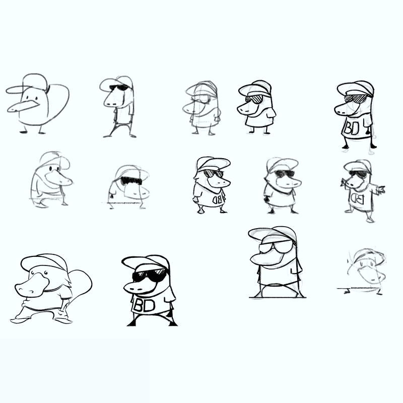
in-progress sketches
Outcome
The resulting Beaver Duck visual identity is a sleek playful design, seamlessly blending creativity, charm, and a touch of quirky humor. Looking cool and having fun — just like the store’s T-shirts.
The simple yet fun design of the logo lets it be used beyond the store website icon. Works excellent on any merchandise and packaging.
On a personal note, I had an immense amount of fun playing with all the ways to show a cool platypus. For quite some time after the project, I still found myself sketching little Beaverducks in fresh sunglasses and hoodies on the sides of my sketchbooks.
