Superhumans
branding, community
Superhumans, is a community of creators, founders, entrepreneurs—all sorts of builders—each having their own superpower. The new community and its online hub, Supergroup, needed an engaging and exciting identity to position the brand as a fun, collaborative game about leveraging one’s great power… and fulfilling the great responsibility.

Process
After a deep dive into the brand foundations we realized that the community needed to burst with energy and personality. A virtual team of super experts uplifting each with their unique abilities? You can’t be dull with that. A team-based gamified experience? This calls for a bold, vibrant feel.
I started by defining a saturated and happy color palette — something that would make for a great superhero costume (unless you are a DCEU superhero, of course).
I continued to build on top of the comic book motif while keeping things original and unique. Throughout the identity I incorporated subtle halftone patterns, split frame layouts, and hand-drawn graphic elements. Added cute 3D icons for a more modern and game-inspired feel. Tied together with the typography that combines a loud epic font for headers with a clean, more modest sans-serif for body text.
Fun stickers/reactions let members express themselves while working together on the community mission: teaming up, saving the world (by making a positive impact), and flexing your superpower — being proud and confident in your unique abilities.

one of the community taglines

icon & pattern sample
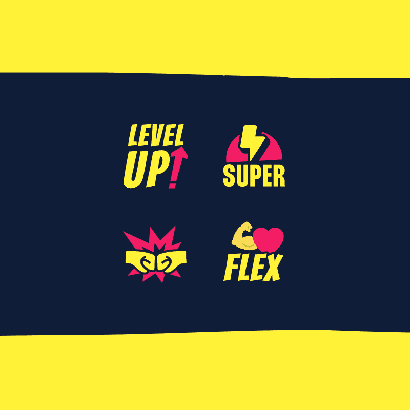
reactions/stickers
Outcome
Looking to take the best from the imagination-sparking comic book worlds, the final Superhumans and Supergroup identity created an empowering world of its own — energizing, empowering, and human.
The bright fun vibe inspires working and playing together to make a positive change in the world. One supercharged collaboration at a time.
